
Style changes throughout the history of architecture usually reflect some kind of relationship between form and content. Accordingly, over the years, worn out slogans have been coined, prominent among them – “form follows function” or the opposite - invisible principles such as space organization (syntax) that reflects the relationship between spaces within the building and between it and its surroundings. This, while the various building styles throughout the history of architecture mainly reflect aspects of culture and society, technological developments, availability of building materials and, predominantly, sensation-evoking components, such as color, form, and texture – three visual elements that mutually influence each other.
The two most prevalent theories related to color perception are Young and Helmholtz’s Trichomatic Theory, and Ewald Hering’s Opponent-process Theory. The first holds that human beings perceive a color through a mixture of three basic colors – red, green and black (RGB) in accordance with the three trichomatic cones that exist in our eyes - cells that respond to three light bands known as Trichotomy.
Developing the concept of Trichotomy, Young discovered that the relative intensity of various types of wavelengths may create any color between three peaks: wavelengths approaching a peak of 564-580 nanometers create red; a medium wavelength that peaks at 534-545 nanometers creates green; and a shortwave whose peak approaches 420-440 nanometers creates blue. On this basis, the wavelengths between them create varying shades, making up the entire color spectrum.
Ewald Hering’s Opponent-Process Theory argues that visible color derives from a subtle process taking place between two opposing mechanisms – blue versus yellow, and red versus green.
Since colors constitute an existential tool for reality assessment, absorption of color differs considerably between the species. Thus, for instance, bees (or mosquitos) perception of color has, over time, developed an evolutionary sensitivity to ultra-purple; its wavelength is shorter than that absorbed by the human eye, while it isn’t sensitive to red, which we consider an "intense color" conveying danger.
In contrast to bees and human beings, spring butterflies are blessed with six receptors, while “pets” like shrimps are equipped with about 12 kinds of receptors, enabling them to distinguish between “friendly” and “threatening” items, compensating for their limited mobility in their habitat.
In this frame, color in general, and certain colors in particular, greatly impact other senses and responses. Thus, for instance, the sense of taste is directly affected by our instinctive response to the color of food: for example, grayish vegetables translate into non-freshness, red meat suggests insufficient cooking, and the brain perceives an orange yolk as related to free-range chickens.
The reciprocal dynamicity which takes place between the three visual agents – color, form and texture – is instinctively translated into an outcome that enables any organism to cope with its natural surroundings. In this field, one can detect the issues of camouflage for assimilation, courtship and reproduction required by all species for existence, which is enormously significant for human beings.
The physiological explanation for this important instinct is that light wavelengths are impacted by the physical qualities of an object – advancing heat absorption, attraction or rejection – and it is this that lends a functional dimension to visual sensors.
So, for instance, while color enhances qualities of light, texture lends the latter a dynamic dimension depending on the perspective (in the style of Agam) or the angle of light radiation.
And, this is where the secret of inimitable Nature’s beauty actually lies, and which explains the unremitting efforts of architecture to see in it an ideal model.
And thus, beyond the spiritual meaning of the visual agencies, in architecture as in nature, they are utilized for functional needs – such as self-shading, slipping prevention, noise and heat absorption or emission, and mainly in generating atmosphere.
Contrary to the usual relationship between form and function, the message here focuses mainly on creating feeling, by maneuvering those senses in order to achieve impacts, such as softness versus harshness, quiet versus noise, calm versus stormy - all in line with the design concept.
All these constitute a significant issue in computerized, contemporary architecture with its unlimited capacity for creating effect - at one extreme, integration in the environment, and at the other - making the object prominent against its background, creating tension, which sometimes results in boundary-blurring.
Boundaries are a primary issue in architecture – from marking territory in space, to outlining the structure of the building with all its components. In this context, one can treat the visual agents through two prevailing approaches: the first is based on independent creation regardless of its structural boundaries; the second is intended to reinforce the architectural outline. While the former relates to color in artistic terms, such as composition, tonality and contrast, the latter argues that uncontrolled exposure to additional content might overwhelm the viewer, diminishing his capacity for sensitivity at the risk of arousing hostility.
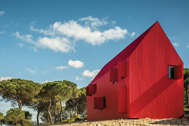
In this light, the approach proposed here is based on controlled exposure in three stages: In the first stage, the intense color against the background of the environment serves to attract and arouse curiosity; this leads to the second stage in which the viewer becomes involved in deciphering the event, attempting to understand the creative intention, which leads to the third stage where he develops an either positive or negative emotional attitude.
This latter stage has great significance as it evokes the user's critical engagement, building a cumulative reference to the building which, in the prevailing rating era, actually determines its shelf life.
As a finishing material, color has always been the cheapest design component with the strongest visual effect. However, with the recent, huge development in the field of lighting, particularly LED, the discrepancy between cost and effect has grown seven times over.
Today, it is possible to “paint” buildings or components without using a paintbrush at all; computerized control and effects enabling infinite, changing facades throughout day and night, depending on circumstances, needs, the mood of the designer or that of the user.
It is important to note however, that “painting” via lighting primarily relates to visibility, while completely overlooking the qualities of paint as a building material – such as sealing, insulation, heat absorption or projection and, in particular, the building’s durability in changing weather conditions.
All this raises questions related to the validity of the modernist concept that advocates “whitening the environment” as if this ensures rational planning, while any freedom of artistic creation as a medium for generating powerful impact is emotional and therefore less important.